Like a well structured essay, website layout, or blueprint - visual hierarchy can be a key to successful images. Ctrl+Paint Store: http://ctrlpaint.myshopify...

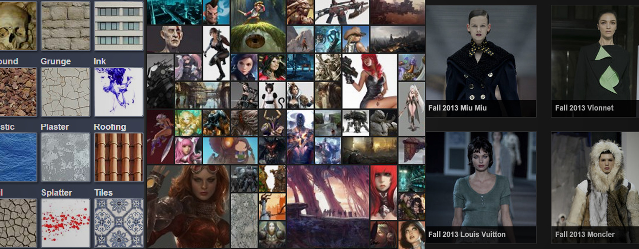
​We've talked about the principles of design - and as you know by now, these are guidelines for organizing the information within a single composition.  The same concept applies when you're working with more than one piece of information, more than one painting, and need to guide a viewer's eyes through the content.  The video in today's post shows the design process for my personal portfolio site - explaining the my layout choices and why I scrapped each one leading to the final composition.  

airportSignage.jpg

Arranging Objects, Large and Small

Information design is necessary when you're trying to clarify something to your audience.  For instance, navigating an airport is a information nightmare: everyone is rushing, and no one is familiar with the layout.  As a result, the designers tasked with creating signage have an important task.  They are trying to prevent people from getting lost, and are forced to compete with a barrage of noise, sound, and crowds.  Next time you're in an airport, though, you'll notice that they did a pretty good job: signs are large and visible, often written in multiple languages.  The signs are placed where they're the most likely to be seen, and they are generally surrounded by negative space or blank walls.  Visual tricks to draw the reader's attention, just like the 2D principles of design.   In fact the more you look into the subject of information design, the more overlap you see with the 2D principles of design.  It turns out these guidelines aren't limited to arranging objects within a canvas, they are used to arrange nearly everything.   ​

iphone_hierarchy.png

Apple: Information Kings

Even though I'm a PC user, I can't help but admire the way Apple advertises their products.  They understand the importance of an information hierarchy, and it's evident by looking at this diagram (right).  I've taken screenshots of the entire vertical scroll for their iPhone 5 website, and stiched them together.  Next to this image I created a diagram simplifying the use of photos and major layout elements into solid color rectangles.  See the shape?  It's like a funnel.  It starts big and bold, and as the reader continues through the piece it gets more and more specific.  The images get smaller and smaller as minute details are explained.  It's an information hierarchy.​

Does Your Portfolio Need an Information Hierarchy?

As I discuss in the video, there was a lot of thought that went into the main page layout for my portfolio.  What I didn't say, though, is that my old portfolio didn't even have ​a main page.  Until recently I limited my website to only my dozen best paintings.  The portfolio section was... the entire site.   And if you're just starting out, I'd recommend this school of thought.  Until you've been working for a few years, it's unlikely that you'll have enough work in total to need an information hierarchy like mine.  My site has upwards of 50 paintings, and those are selected out of a much larger total grouping.  As a result, though, I couldn't get away with a single page website any longer.  For the sake of my audience, I needed to put a road-map for the content and make the general groupings more obvious. 

As the internet becomes more and more cluttered with content, art and otherwise, you'll need to compete harder for attention.  In this environment, knowing how to control a viewer's attention and gaze is crucial.  Are you considering your personal information hierarchy?​

Posted
AuthorMatt Kohr
12 CommentsPost a comment

Enjoy the videos and music you love, upload original content, and share it all with friends, family, and the world on YouTube.

Writing is a topic I've never covered on Ctrl+Paint, but it's time to broach the subject.  I hope you won't be mad when I tell you that your writing could be... better.  Based on the thousands of emails I've received from Ctrl+Paint readers it's safe to generalize:  you guys aren't prioritizing writing.  I'm not telling you this as an insult, but because you probably won't hear it from employers.  Since we are all competing for attention, your skill with words is nearly as important as your skill with a paintbrush.  This video explores the art of writing email.  The importance of structure, editing, and most importantly brevity are often overlooked by 'visual communicators', but it's worth your while to practice these skills.  

When in doubt, say less.​

Posted
AuthorMatt Kohr
20 CommentsPost a comment

I have a google alert set to notify me of me newly posted 'digital art tutorials', and it routinely frustrates me.  Every time I see a blog post with a title like '40 Amazing Digital Painting Tutorials' I want to pull my hair out.  It's not clear when this trend started, but the results are obvious: beginners are being mislead.  Art technique is hard, and takes years to learn.  A simple look a DeviantArt or Youtube video comments reveals that beginners aren't satisfied with their painting skills and have no idea why they aren't improving.   It's totally reasonable that they feel this way, in my opinion, because the internet presents digital painting as an easy skill to master.   In reality, it's not!  Art is hard work.   More specifically, it's both technical and mechanically challenging.  First, watch the short Ira Glass video to the right - it's a fantastic bit of advice.  Now let's consider the process of learning to digital paint in two major parts, and where the internet tends to shortchange beginners. 

Ira Glass of "This American Life" talks about the building blocks of a great story. http://www.pri.org/this-american-life.html Video courtesy of Current TV http://www.current.tv

The Technical Side

You might think that learning to digital paint is like learning to make other digital files - it's both technical and rule driven.  So the web ought to do a great job at teaching this - after all, learning things like HTML, video editing, or making podcasts are very well documented by online tutorials.  But it doesn't.  This mode of thinking leads to project-based tutorials like "paint a flaming eyeball" and "create stunning concept art robots" (in case you're wondering, those are fake names) which lay out a series of steps to follow in order to make a specific final result.  This teaches the software part, but it completely glosses over the most important piece: painting. Digital painting, after all, is essentially just.... painting.  So if you're feeling frustrated about your results, ask yourself: how are your traditional skills?  This leads me to the second half of the equation.  

The Mechanical Side

Painting and drawing use finely-honed motor skills.  Just like playing a sport, you can understand the rules in a half hour -- but that doesn't mean you can play professionally.  The only way to improve is through repetition.  Practice, and practice, and practice, and your technique will improve.  This is the void left by the internet. When was the last time a Youtube speedpaint video talked about years and years of practice?  Practice isn't sexy.   But it's an undeniable truth, and you'll be a happier artist if you're prepared for a marathon, not a sprint.  Even as a professional concept artist I am learning every day, and plan to hone my craft for generations to come.  It's not a fast process.  Like Ira Glass describes in the video (above), there's going to be a gap between your current skill and your current taste.  The real challenge is coming to terms with this struggle, because you're going to feel if for a long time.  You're going to feel it for years.  Hopefully, you'll feel it (in some small way) forever -- because there's always more to learn.

Help Change the Conversation

The internet brought us all together.  Even if much of the training content available glosses over the value of traditional drawing and dedicated practice, it brought a bunch of artists together from all over the world to start a conversation.  That's extremely cool.  We're all learning, and we're all in this together.  Since you'll have opportunities to give feedback to artists with less experience than you, remember to encourage the value of  'foundation'.  If you see someone struggling with their digital painting, ask them how often they practice drawing with a pencil.  See a beginner overly concerned with the particulars of photoshop, or which tablet to buy?  Remind them that drawing in correct perspective is far more important.   Ultimately, the most important part of 'digital painting' is not 'digital'.  So let's help change the conversation.  Art is supposed to be hard work. 

Posted
AuthorMatt Kohr
34 CommentsPost a comment

There is more than one way to light your scene. What is your lighting adding to the story? This video introduces some of the psychological implications of typical lighting setups. In fact, it's common for beginners to ignore lighting completely, rendering forms in a generalized way. As you progress as an artist, however, you'll need to harness the narrative power of light and make it work for your compositions -- not against them.  

Imagining light

If you're not painting from observation, light is even more important.  It's often obvious in beginner work that the artist does not have a strong grasp on the principles of light, because their imagined spaces are flat and confusing.  For this reason, light is one of the five categories I ​explore in the newly launched "Observation to Imagination".   I've always been a huge fan of light and it's power for storytelling, and luckily the new premium series gave me an opportunity to explain my approach.  

Mood & Light

The painting below is very loose and painterly, but the mood is set elegantly with a bit of intentional lighting.  In this case the deep shadows are deep and atmospheric, allowing the artist to use implied detail instead of extreme polish.  More than anything, Atack is revealing just enough​ of the scene to activate the audience's imagination - and he's doing it with intentional lighting.  

​Noble's Island by Josh Atack

​Noble's Island by Josh Atack

These two images to the right are painted by the same artist: Dorje, and each has a very different mood.  Once again, it's not an overwhelming use of polish or detail used to tell a story in these pieces... it's light.  Light used carefully and intentionally.  Beginners often add light as an afterthought, overlooking the massive impact it has on the mood of an image.  Instead, one might consider the light and color palette before even designing a composition - letting mood​ drive the piece instead of objects.  When was the last time you started a painting by choosing a lighting situation?

Ultimately, painting light is.... just painting.  Some painters would argue that there is nothing else.  It's a lifetime pursuit.  In my opinion, though, it's a constant source of beauty - and worth the challenge.  If you're looking for books specifically aimed at this topic, I highly recommend "​Color and Light: A Guide for the Realist Painter".  It's written by James Gurney, and does a wonderful job simplifying a complicated subject.  

I hope that you already love light as much as I do.  But if you don't,I encourage you to spend this week looking at paintings with one thing in mind:  light.  How are they using it? What is it telling about the mood?  Why have they decided to use shadows?  In a good painting, none of this is arbitrary.  Have fun studying!

​Fortress of Summer, Dorje  (click to enlarge)

​Fortress of Summer, Dorje  (click to enlarge)

​Highland Gap, Dorje (click to enlarge)

​Highland Gap, Dorje (click to enlarge)

​Art trade

I've just listed a couple of my recent favorites here, but there is a whole world of other artists using light to their advantage.  In the comments, I'd love to see a list of your favorites so we can all trade influences and enlarge our inspiration folders.  ​

Posted
AuthorMatt Kohr
CategoriesUncategorized
19 CommentsPost a comment

New Structure

Each revision of Ctrl+Paint has been a bit different, but I'm extremely excited about the simplicity of the Video Library.  Many of you asked for a list, and you were right: it's a great way to see the big picture!

New Schedule

From this point forward, the new schedule is 1 written post every Thursday.  Tuesday and Thursday took on special meaning for me these last two years, so it's going to be a bit strange switching to a single Thursday weekly post.  That said, you can look forward to much more activity on Facebook and Twitter - so get connected!

Same Goal

I want to teach you to digital paint, plain and simple.   The page is still totally ad-free, and my focus is on teaching the material as clearly as possible.  I thought it would only take six months to get to this point, but it ended up taking two years - now I'm excited for the next two years!

 
Posted
AuthorMatt Kohr
40 CommentsPost a comment