Which would you rather have: five mediocre things or two things you really love? In theory I prefer the two, but I often choose the five mediocre ones out of habit. Because we're on the internet, it's extremely easy to have everything. And though this might seem great at face value, it can be deadly to your creativity. When was the last time you bought an art reference book and read the entire thing? In a digital age where it's really easy to get stuff, sometimes we overlook the benefits of getting rid of stuff. Let's take a look at this idea in the big picture first, and then in terms of creating artwork.
Prioritize your activities.
In "Focus Your Time" I talk about getting more done by doing fewer things. It might seem obvious, but it actually takes a constant effort to stay on top of this concept. One of my challenges is being a gamer. I really enjoy playing video games, but have recently decided to cut out console gaming and limit myself to handhelds. Though it was a hard choice, it's allowed me to spend more of my time on creative pursuits, without completely eliminating the fun of gaming. What can you cut out of your schedule?
Limit your options.
One of the most common questions I get from you guys is about creativity. Specifically, it's about feeling a lack of creativity. In reality you might just be suffering from option-overload. A blank canvas is the ultimate open-ended question, which can stop many artists in their tracks. Can't think of what to draw? Limit the scope. In “give yourself assignments” I talk about pretending to be an art director for your own personal work. Random generators are another great opportunity.
Limit your colors.
Some of the most engaging paintings use color as a beacon – not as an overall barrage. See how this Tron painting by Vyle draws your attention to the focal point? This recognizes the power of restraint and the use of negative space to empower the subject. It's all about relativity: 'bright' is only possible when surrounded by 'dim'.
Cut the visual clutter.
It's easy to assume 'more realistic' means 'more detailed', but that's almost never the case. If an image is clear, it doesn't need much visual information to tell a big story. Storyboards are a great example of this efficiency in action. These great sketches from How To Train Your Dragon prove you don't need photo-realism to get the point across. Even though you are able to add details doesn't mean you should. Just like with color, use detail sparingly.
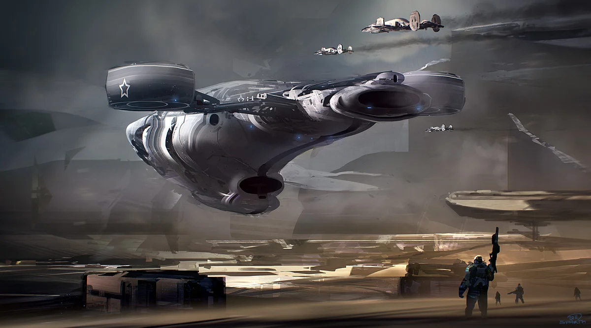
Another great example of this principle is the work by Sparth. If you follow the game industry, you've probably seen his designs. The cars for Id software's Rage proves that he's more than capable of detailed imagery (below left), but many of his illustrations like the one on the bottom right make wonderful use of selective focus. The spaceship is very detailed, though the background is left atmospheric; activating the viewer's imagination.
Subtract everywhere.
As I've shown, eliminating the unnecessary is a great way to highlight the good stuff. In fact, I'm experimenting with this as a personal creed. In an attempt to make better art and get more out of my time, I'm on a constant hunt for things to eliminate. So let's talk about it in the comments...What can you cut?


