This post could be quite short. The title says it all. But I want to elaborate with some of my personal experience, and share some links to well written blog posts on this deceptively simple aspect of illustration: thumbnail sketching. If you're not familiar, I'm talking about the quick preparatory sketches created before an illustration. Varying in style from artist, the only constant with thumbnails is that they are planning images. Often crude and loose, they serve to collect your thoughts and make composition decisions.
My Struggle With Thumbnail Sketches
A proper illustration, concept design, or graphic layout begins with 20 or more thumbnails. This forces you to try a variety of options and eliminate all but one. Ever since I made the switch to a digital process, I've found myself occasionally skipping the thumbnail sketching phase of my illustrations. Not always, and not for any particular reason - it's just been happening recently. The real danger that I've discovered is wasted time. It might seem like I can save time by skipping an entire portion of the illustration process, but the net result (more often than not) is an illustration that's hit a 'dead end'. A dead end is when I realize my composition is broken, but I've already spent hours and hours working on specifics: anatomy, rendering, texture, etc. A dead end painting is often not worth fixing, and a totally fresh start has better odds at solving the visual challenge.
Something Missing
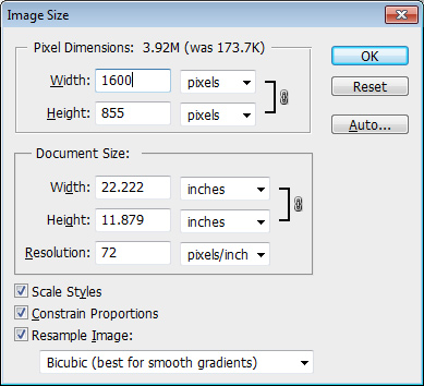
I've explored the possible reasons for skipping thumbnails, and my best explanation is that digital art is 'fluid'. There's no fundamental divide between lines and paint - just a few keystrokes. A small image can be turned into a large image just as quickly. What this means for me is the temptation to transition from a 'thumbnail' straight into the final image simply by opening 'image size' and adding more resolution. This method has its positives, but it eliminates a potentially critical step from the natural media process: review. When I used to make large pages of thumbnail sketches in a sketchbook, I was forced to look at all of them next to one another and select the best one. Next I would enlarge this image (usually manually) onto high quality paper and begin the tight pencil sketch. I always thought of this process as a nuisance, one streamlined through the digi-ficaiton of my workflow, but now I'm not so sure.
A New (Old) Approach
My new idea is to go back to the old way. Not necessarily with paper and pencil, but with the same fundamental concept: lots of ideas generated quickly. Since Photoshop is my medium, I'll need to figure out a way to keep the spontaneity found in 1.5"x1" pencil drawings. The primary main problem with my digital thumbnails, historically, is a tendency to over-polish. My new (old) approach will combat this problem by focusing on a short list of guiding principles:
Quantity. At least 20 images, ideally all on a single page.
Simple Media. To keep my ideas flowing, I'll limit the tools to a single brush and single eraser.
Work Small. Drawing physically small on-screen might help me avoid overworking them. No zooming in.
B & W. Even though I love color, I'll keep that for the second phase of the process.
Composition Basics: Sketching thumbnails- by Dan dos Santos- Dos Santos is an amazing cover illustrator (you've surely seen his work), and does a great job articulating his digital thumbnail process in this article. I especially like his artificial limitation of '4 gray-scale values'.
The Thumbnail! By Jon Foster - Another amazing illustrator, and if you've seen his work it all seems effortless. This post exposes all of the planning and scrutiny that leads to such dynamic final paintings. It all starts at 1.5" tall.
Part 4: Pteranodons / Hatchling Sketches - By James Gurney - The only thing I love more than Gurney's work is his thought process. His blog is a gold mine of insights, and this article on the thumbnail / art direction process will not disappoint
Tips From Other Illustrators
Clearly this is an important issue, and my mistakes should not be your only study materials. To the right is a list of fantastic articles on the subject, created by a variety of working artists. If you know of any other blog posts on the subject of thumbnails, please post them in the comments!
The Bottom Line
Thumbnails aren't beautiful, but they are critical. Every time I spend my time with them I'm pleased with the final painting. If you're new to illustration now is an important time for forming good habits, so please - please - make thumbnail sketching a part of your routine.


