Walk into a nice art gallery or museum, and you immediately a sense for the artwork's importance. Starkly illuminated on a white wall, paintings command attention and respect. Walk into a cluttered gift shop and you get a very different impression. Even if you're not displaying your art in galleries, it's likely that you are displaying it to the public. Is your portfolio sending the right message about your artwork? This post deals with the importance of presentation. We'll focus on web design - though the same concepts can be applied to your physical portfolio.
Less is more
When objects are surrounded by negative space, they're empowered. Artwork with room to breathe just feels... strong. By selecting one image out of 100 to place on a wall, it is automatically imbued with authority. As you construct a portfolio website, the first and most important step is to be selective. If you want to express 'art gallery' not 'gift shop'. Choosing a small set of strong portfolio pieces is essential
Emphasis
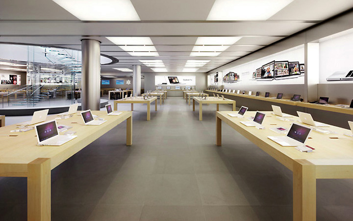
Galleries are spaces designed to direct the viewer's attention. Instead of getting lost in the sea visual clutter, the art stands out as important. Through intentional use of lighting, contrast, and wall color the artwork it emphasized. Have you watched my free videos on the Principles of Design? If so, these principles might sound familiar. The same rules that help guide a viewer's eye through a composition can be applied to your website or portfolio. Specifically, using contrast emphasis to intentionally direct the eye. The Apple store and website are great examples of this spartan clarity: you can't mistake what they're trying to sell you. There's nothing to visually distract from their products. When making your personal website, how can you borrow these successful principles?
Interior of the Apple store
The value of good craftsmanship
I wish that this would go without saying, but here goes: review your work before uploading it to the internet. It's painfully simple, but I can't tell you how many sloppy portfolios I've seen from beginners. Regardless of the work itself, clean presentation empowers any image. Are you adding borders to your work? Make sure they're the same width and color. Do you sign the images? Keep your signature size consistent. Are you placing a watermark on each image? Keep it small and along the bottom edge. In short, make it clear that you care. Inconsistency can communicate a disinterest or lack of focus.
It all adds up to 5 crucial seconds
Your website or portfolio is the ultimate 'first impression'. Like it or not, it's going to be met with snap judgments. The first few seconds might be all it takes for a viewer to dismiss your art completely. Alternately, the first five seconds might entice the viewer to scour your entire portfolio. With all of this on the line, make sure that the first impression is a good one. After all, stepping through the doors of an Apple store sends a very different first impression than walking through the doors of a cluttered gift shop. Which experience would you rather create?


