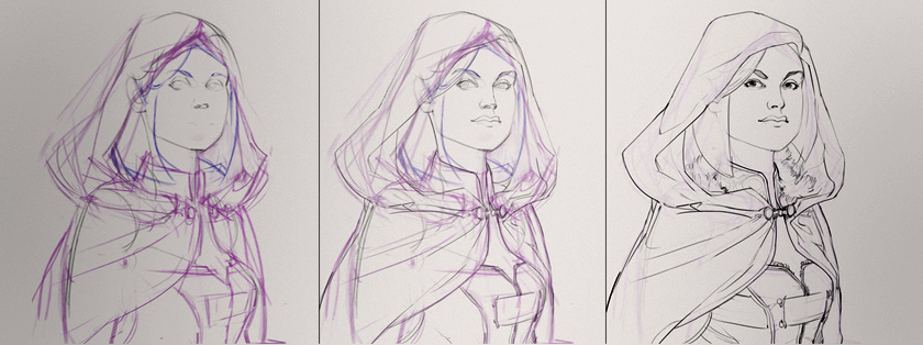
What should I draw today? This is possibly the most common question to any artist - beginner or pro. Unless you're given an assignment by your client/boss, t...

What should I draw today?  This is possibly the most common question to any artist - beginner or pro.  Unless you're given an assignment by your client/boss, this question has a tendency to paralyze. Since I work much more fluidly from an assignment with narrow guidelines, I've begun 'generating' fake assignments for my personal art. This is a fun way to have spontaneous ideas and get yourself out of a drawing rut. As I mention in the video, here are some links to fantasy and sci-fi generators to get your ideas flowing: From donjon: Sci-fi character, Sci-Fi Spaceship, Fantasy Character, Fantasy Castle, Weather

From Chaotic Shiny: Flag, Musical Instrument, Fighting arena, Magical familiar

Special Bonus:  I spoke with the creator of Chaotic Shiny and she asked for generator ideas!  She liked the idea of these being used for artwork, and is willing to field ideas for custom generators.  If you have any ideas for random generators, please put them in the comments!  I'll make sure to pass along the results.  

Posted
AuthorMatt Kohr
CategoriesComposition
39 CommentsPost a comment

For some, a standard keyboard is plenty... But have you considered going further? This video showcases my personal hardware setup and how I use it for painting. Before you go out and spend lots of money on USB devices I want to be very clear: none of this is essential. However, as I state in the video, if you often spend long stretches on the computer you might want to give this a thought. Additionally, your hardware solution will be different than mine.  The best part about going down this road is that each artist has different needs and workflows, so each setup will take a different form.

1)  Cintiq 21UX by Wacom (currently replaced with newer models) This is the ultimate painting tool.  I was using standard USB tablets for 10 years before I got one of these, but I might have trouble going back at this point.  Very expensive, but wonderful for painting.

2)  SpaceExplorer USB by 3Dconnexion If you do much 3D modeling, you might like one of these.  I use this exclusively for Sketchup, and it allows me to use my right hand for sculpting, while my left hand stays on the SpaceExplorer controlling the camera and issuing hotkeys.  Though it's not cheap, it has dramatically changed the process of 3D modeling for me.   If you want to see this in action, watch this video -- it's a great demonstration, and essentially sold me on the device.

3)  Shuttle Pro 2 by Contour (available on Amazon) This is the heart of my painting interface.  I like the prominent knob for changing my brush size, and the overall ergonomic layout.  If you were to get one piece of custom hardware, this might be a good pick.

4)  Multi-function Gaming Panel (MFP) by CH products  (see pictures here) (available at @ Buy.com) This is a platform with buttons that you position and then bind to keyboard shortcuts or macros.  Very cool, but also very expensive.  If you want total ergonomic control, this is as flexible as it gets.  Want to see it in action?  This video from E3  2009 should help explain it.

5)  X-Keys 24 Programmable Keypad by PI Engineering These are my lowest priority buttons such as media controls, opening specific folders with a single press, etc.  A variety of things that I couldn't easily hard-bind my standard keyboard to do.  Besides.. you can always use a few more buttons, right?

Posted
AuthorMatt Kohr
55 CommentsPost a comment

To finish up the mini-series on advanced masking, this video introduces the concept of "selection building". Though this is not an official title, it's a pro...

To finish up the mini-series on advanced masking, this video introduces the concept of "selection building". Though this is not an official title, it's a process by which you make the job of creating complex selections easier and less frustrating. This technique is especially useful if you're adding graphic or pattern overlays on to your characters. If this seems abstract or challenging make sure to give it a try for yourself -- like other types of masking, it's much easier once you've had a hands-on experience.

If you're not familiar with masking, these are good videos to watch first: Masking 101 pt.1, Masking 101 pt. 2, Masking 101 pt. 3

To follow along with the video, here's the robot PSD for download.

And to learn about applying 2D decals using the warp tool watch this video: Warp Tool

Posted
AuthorMatt Kohr
13 CommentsPost a comment

This video proposes a fun way to experiment with imaginary drawing techniques. Ctrl+Paint Store: http://ctrlpaint.myshopify.com/ Full Free Video Library: htt...

The gap between observational drawing and drawing from your imagination can be tricky for beginners.  The idea of this exercise is to start with a grounding in the real, observed, world - and then adding your own imaginary details.  Though this doesn't have much practical application in a portfolio, it's a great first step towards drawing dragons and space marines.

Posted
AuthorMatt Kohr
7 CommentsPost a comment

Edge control is often the key to efficient painting. As you've seen in Advanced Masking pt 1, nesting masks adds a high level of flexibility to the painting ...

Edge control is often the key to efficient painting. As you've seen in Advanced Masking pt 1, nesting masks adds a high level of flexibility to the painting process. This video will continue the idea of nesting masks by exploring complex selections. Even if these ideas may seem abstract at first, they are worth learning. In my experience, once you begin to utilize methods like these you're able to approach Photoshop from an entirely different angle --- and will find yourself problem solving in a whole new way.

If you're not familiar with masking, these are good videos to watch first: Masking 101 pt.1Masking 101 pt. 2Masking 101 pt. 3

If you want to experiment with the PSD file from the lesson, here is the robot for download.

Posted
AuthorMatt Kohr
10 CommentsPost a comment

Are you using masks to their full potential? Do you even know what masks are? If you answered no to either of those questions, get ready to have your mind bl...

Are you using masks to their full potential?  Do you even know what masks are?  If you answered no to either of those questions, get ready to have your mind blown.   Masking is one of the most abstract concepts in Photoshop painting, but in my opinion it's the secret for truly efficient workflows.  Though it doesn't feel like a traditional painter's process, it's a skill no digital painter should live without.  This video focuses on painting textural overlays and the concept of 'nested masking' for maximum versatility.

If you're not familiar with masking, these are good videos to watch first: Masking 101 pt.1Masking 101 pt. 2Masking 101 pt. 3

If you want to experiment with the PSD file from the lesson, here is the robot for download.

Posted
AuthorMatt Kohr
18 CommentsPost a comment

Art school is great, but it's not for everyone. Even for those that attend, it's only the beginning of their actual education. Most of the skills I use every day in my art are self taught. Whether it was in my spare time, on the job, or learned from friends: much of my technical knowledge was not learned at art school.This video explores the "making of" Ctrl+Paint to see what skills were necessary to create the site, and where I learned them. Ultimately, we're never prepared for huge projects. Even if you can draw a great still life, art college does not prepare anyone for the challenges of real life. Luckily, you never have to stop learning!

Posted
AuthorMatt Kohr
41 CommentsPost a comment

Have you ever worked on a painting for so long that you fooled yourself into thinking it was good? You were in "The Monkey House". It's a common affliction f...

Have you ever worked on a painting for so long that you fooled yourself into thinking it was good? You were in "The Monkey House". It's a common affliction for artists, and hopefully this video will allow you to learn from my mistakes. Many of the videos on this site explain technique or concepts -- this video it different: it's a painting story. A story that ends with me wasting the better part of a day. And just think, it all could have gone differently if I remembered to make thumbnail sketches!

Posted
AuthorMatt Kohr
CategoriesComposition
38 CommentsPost a comment

One of the most exciting subjects to paint is landscape - but many artists don't know where to begin. This video shows one approach. Just like in the previou...

One of the most exciting subjects to paint is landscape - but many artists don't know where to begin. This video shows one approach. Just like in the previous video where we did a "Tiny Study", these are small thumbnail sketches. Creating a small drawing like this allows you to quickly explore compositions without investing too deeply in a single image. Most importantly, working small like this is a way to lower your expectations - it's a lot less stressful working on a tiny painting that can't fit any details. And if you like this video, please remember to click the “Like” button at the bottom of the post! The only advertising for Ctrl+Paint is word of mouth, so I’m counting on you guys to spread the word. Thanks!

Assignment: Create Landscape Thumbnails

Things to consider: Use the photo as color and material reference, not for shape.

Recommended videos:The "Tiny Study",

Posted
AuthorMatt Kohr
36 CommentsPost a comment

We've talked about starting small and working bigger - but this time we're going to start tiny. Color is challenging to work with, and much of the instructio...

We've talked about starting small and working bigger - but this time we're going to start tiny. Color is challenging to work with, and much of the instruction on Ctrl+Paint is done in grayscale. If you want to start working directly in color I recommend the 'tiny study' exercise. When you're looking at a photo filled with rich details it's tempting to re-create each pebble and tree. This exercise forces you to simplify what you're seeing, skip the details, and only paint the colors. Even though the end result won't impress your friends, it helps hone your eye for color and builds a foundation for landscape painting.

Posted
AuthorMatt Kohr
TagsColor
43 CommentsPost a comment

If you're exploring various color palettes and moods for a piece, Photoshop has a secret tool to help you speed through the process. It's actually not a secr...

If you're exploring various color palettes and moods for a piece, Photoshop has a secret tool to help you speed through the process. It's actually not a secret, but many illustrators simply don't know about it.  Unlike other color overlay techniques, this command will replace colors based off of their value.  This means that your highlights will be treated differently than your shadows, etc.  To properly use this technique you'll need to know how to create a gradient in Photoshop, though it's not discussed in the video.  Luckily, gradients are a very old feature for Photoshop and Illustrator, so it isn't hard to learn about them on the internet.

Posted
AuthorMatt Kohr
CategoriesDesign
30 CommentsPost a comment

Photoshop's versatility is a great asset.  One moment you might be penciling a comic page, and the next you're laying in colors.  Do you change your workspace along with the task? This video introduces the 'workspace' feature which keeps your palettes organized. Since each task requires a different set of tools and information onscreen, it's nice to save preset workspaces to reflect each one. Like many user interface features this may seem simple and uninteresting - but once you begin using Photoshop for long sessions you'll understand its importance.

Posted
AuthorMatt Kohr
9 CommentsPost a comment

If you're looking for an easy, surefire way to improve your composition... look for visual tangents. These little, accidental, crossed lines can drag your im...

Some composition guidelines are abstract and vague. Tangents, on the other hand, are very straightforward.  As the video shows, they're a quick way to add visual confusion and flatten the depth out of an image. Once you know what to look for they're easy to avoid - and then you can be tangent-free for good!

And if you like this video, please remember to click the “Like” button at the bottom of the post! The only advertising for Ctrl+Paint is word of mouth, so I’m counting on you guys to spread the word. Thanks!

Posted
AuthorMatt Kohr
CategoriesComposition
21 CommentsPost a comment

It's really hard to break the habit of focusing on an object's outline. We've learned to imagine shapes from the time we were small children. But one of th...

We're trained as children to think in terms of 'shape'. This is one of the things you have to overcome when learning to be an artist. Seeing shape is fine for some things, but observed drawing is best done in terms of form instead of shape. Shape is a 2D abstraction, form is seeing in 3d - with depth and volume. To finish out perspective week this video provides an exercise to help you envision form. All you need to do is go find some cool pictures of bugs!

And if you like this video, please remember to click the "Like" button at the bottom of the post!  The only advertising for Ctrl+Paint is word of mouth, so I'm counting on you guys to spread the word.  Thanks!

Assignment: Overlay form lines onto photos of interesting bugs.

Things to consider: Draw through the object, envision the structure.

Posted
AuthorMatt Kohr
CategoriesDrawing
59 CommentsPost a comment

Even if you don't think you're making a 'perspective drawing', you are. To avoid some common mistakes, you first need to know where your horizon line is. Thi...

Even if you don't think you're making a 'perspective drawing', you are. To avoid some common mistakes, you first need to know where your horizon line is. This video explains how to find it, as well as common problems that result from ignoring it. Make sure to download the worksheet at the bottom of the page, and have fun!

And if you like this video, please remember to click the "Like" button at the bottom of the post!  The only advertising for Ctrl+Paint is word of mouth, so I'm counting on you guys to spread the word.  Thanks!

Assignment: Add the horizon line to each sample composition.

Things to consider: High angle, low angle

Worksheet Downloads:Horizon Line and Viewpoint Worksheet, Horizon Line and Viewpoint Worksheet (printer friendly version)

Posted
AuthorMatt Kohr
CategoriesUncategorized
34 CommentsPost a comment

Perspective is incredibly important. It's also a subject that many artists avoid because it seems very stiff and technical. I created Perspective Sketching t...

Perspective is incredibly important. It's also a subject that many artists avoid because it seems very stiff and technical. I created Perspective Sketching to teach the subject in a different way: freehand sketching. In my experience this approach to perspective changes it from deliberate and stuffy into a natural part of drawing. Though Photoshop is featured in the videos, all of the skills apply to traditional media or any other graphics software. These two newest additions to the Ctrl+Paint store will be available Friday August 10th. Though each series can be watched independently, they were designed as a pair.

Posted
AuthorMatt Kohr
CategoriesUncategorized
33 CommentsPost a comment

Have you gathered some reference materials? This video demonstrates how you might use it in your illustration. Ctrl+Paint Store: http://ctrlpaint.myshopify.c...

In the last assignment you gathered costume reference for real-world professions. Now it's time to have some fun with that visual research! I've provided you some mannequin drawings to use as the foundation for character designs. Your goal is to make a few designs that would actually fit into a modern context. I don't want to see any space marines -- just real world professions. Think it's easy to draw a police officer? How about a fire fighter? Now is your chance to find out. As an illustrator or concept artist you'll need to draw things like this surprisingly often. Additionally, they help build your visual library for costuming and will improve your ability to generate sci-fi and fantasy characters. Good luck! And if you like this video, please remember to click the “Like” button at the bottom of the post! The only advertising for Ctrl+Paint is word of mouth, so I’m counting on you guys to spread the word. Thanks!

Assignment: Create realistic character designs (from reference)

Things to consider: Use specific details, "dress your model"

Recommended videos:Costume Reference, Costume Sketching

Worksheet Downloads:Basic Male Figures

Posted
AuthorMatt Kohr
CategoriesDesign
19 CommentsPost a comment