Ctrl+Paint - Digital Painting Simplified

Home
recent videos
Free Video Library
concept art playbook
Ctrl+Paint Store
Info
About / Contact Resources FAQ
june-updat_blog hero.jpg

June Update

Hey guys!  This week I want to update you on my upcoming plans for the site.  As of this month I've decided to leave my job as a full-time concept artist, and to focus much more of my energy on creating content for Ctrl+Paint.  I'm very excited about the changes, and am happy to finally share them with you.  Here's what's in store:

update-images.png

New Free Videos

Each Thursday, in place of the written blog posts, I'll be releasing new free videos.  They'll be very visible on the front page of the site, but will also be added into the recommended viewing order of the library.  I've learned a lot since completing the library, so it's time to flesh out some of the sections.

Critique Mini-Series

As a longer-term plan, I'm creating a mini-series about critique.  At art school, we spent a lot of time at the critique wall.  As in... a real lot.  It's certainly a subject worth adding to the Ctrl+Paint library.  To do this, I'll need art submissions from you guys.  If you'd like to get feedback about your work and help me out with this important mini-series, get the details here.

Community Feedback

I'd love to hear from you!   To offer your opinions, there are a number of short surveys available - allowing you to help direct  future site content.   Is there a question you've been looking to ask? Let's hear it!  Here are the currently available surveys: 

- Mac or PC?  A few questions about hardware and software

- Video Topic Suggestions

New Premium Videos Coming to the Store

While working in the game studio, I've been slowly adding 'cool video ideas' to a list.  Now that I've got the time to dedicate to it, I think you'll be happy about the upcoming releases for the store. 


Back to top | RSS | Blog Home

PostedJune 26, 2014
AuthorMatt Kohr
56 CommentsPost a comment

Beyond the Comfort Zone

starting.jpg

If you have access to Netflix or Netflix streaming, this week's homework is simple: watch the documentary "Tiny".  Though the movie focuses on a man building his own 200 sq. ft. house from scratch, it's his approach that really had an effect on me.  If you're feeling overwhelmed by learning to paint, or it seems the odds are stacked against you , "Tiny" is the perfect remedy.

The Setup

Christopher wanted to build his own house.  He made this decision based on passion and determination, but very little else.  Setting aside a single summer for his project, he aimed to create a ~200 sq. ft. 'tiny house' with no savings or construction experience.  My initial reaction to his plan was "this guy's an idiot".  Regardless of my apprehension, Christopher buys a stack of lumber and a trailer - and the project begins.

The Learning Process

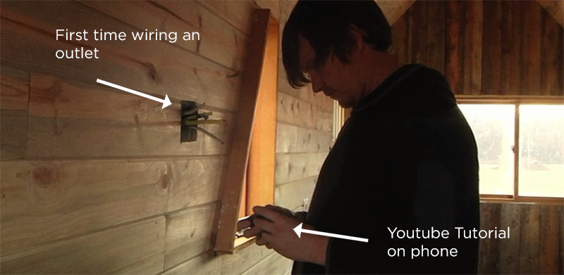
Without any teachers or guides, Christopher needed to teach himself all of the necessary skills to tackle his challenge.  The initial plan was cobbled together from information found on blogs, and everything else was a matter of 'learning on the job'.  Electrical work?  No problem, there's a YouTube video for that.  It's impossible not to smile while christopher follows youtube instructions on his phone- snipping wires and plumbing his tiny house in the Colorado countryside.   Christopher's true skill wasn't excellent carpentry, but a willingness to learn.  Each roadblock required him to slow down, learn a new skill, or invent his own solution.

Then Things Go Wrong

When it's clear that three months isn't going to be enough time, the project takes on a very different tone.  The weather gets bad, his money runs out, and everything stops being fun. But he doesn't give up.  Through a combination of determination and creativity, Christopher manages to finish the house.  It took a year to do it, but it worked.

porch.jpg

What's Your "Tiny House"?

If you're learning to digital paint, it's a long and hard road.  You probably won't have a teacher, and won't have the ideal tools.  When roadblocks happen, you probably won't have a mentor to guide or comfort you.   It's unlikely that you'll be ready to submit your portfolio professionally as soon as you'd like.  You'll have hundreds of 'bad drawing days' along the way.  The big question, though, is "will you give up?"  Like building a house with your bare hands, art isn't easy - but it's absolutely worth the hard work.  What are you waiting for?

Back to top | RSS | Blog Home

PostedJune 19, 2014
AuthorMatt Kohr
19 CommentsPost a comment

Are You Telling a Story?

Painting is partially about technique, and that’s what Ctrl-Paint often focuses in - but it’s also about storytelling.  This week’s week we’ll examine a painting from Nick Gindraux and see what lessons it offers for your own visual storytelling.

Art by Nick Gindraux.  See more awesome paintings at his website.

Art by Nick Gindraux.  See more awesome paintings at his website.

Time Passing

Looking at this piece of concept art, you’re thrust into the center of a story.  You’re not seeing the aftermath of an event, or the calm before the storm - you’re right in the middle.  Without any explanation, you know what action is unfolding.  Gindraux has composed his painting with a series of thoughtful choices, and the result is an effortless sense of presence.  But what, specifically, has he done to imply the passage of time?

Before and After

What Gindraux gives the viewer in this piece is a mental coloring book.  He’s shown you the way the scene used to look, and invites you to imagine how it might look in the future.  As your imagination takes an active role, the painting comes to life.  An iconic shape like a star or circle begs to be completed. This painting takes advantage of our natural desire for order by inviting us to complete it through mental extrapolation. You might not know why the painting seems engaging, but it’s no accident that you’re intrigued.

Details

The large red star represents the initial ‘read’, but the image is filled with subtle details backing up the primary action.  Even though the red is unfinished, notice that the shape was first outlined in the soil with tire-tracks.  The haphazard white tire tracks on top of the star also indicate the passage of time.  Like footprints in wet concrete, these tracks are freshly made.  The story continues when you look behind the trucks.  A small stack of red barrels lays at the threshold between painted soil and untouched earth - are these waiting to be loaded into the back of the trucks?  Were they just emptied?  Either way, Gundraux is explaining how the action unfolds - how his world operates.

Artist as Storyteller

As you progress in your craft, the technical hurdles will fade.  As this happens, the substance of your artwork will be more than fancy rendering and accurate annatomy: you’ll be telling stories.  Odds are, the artist that you like best are diong this with every painting they make.  It might not be as obvious as this large red star, but they’re infusing their composition with  narrative details.  Next time you find yourself looking at an impressive painting, ask yourself “how are they telling me a story?” With practice, you’ll start adding those details to your own work.

Back to top | RSS | Blog Home

PostedJune 12, 2014
AuthorMatt Kohr
6 CommentsPost a comment

Design Your Own UI

Adobe Configurator 4 - It's free! 

Adobe Configurator 4 - It's free! 

When it comes to customizing Photoshop, hotkeys are only one approach.  Did you know you’re able to create entirely custom tool palettes?  This week we’ll explore the rarely mentioned “Adobe Configurator”.

Configurator 4.0

To begin, you’ll need to download a small piece of Adobe software called the Configurator: (visit Adobe labs to download your copy).  Once installed, you’re presented with a blank canvas - but this canvas is for creating User Interface elements, not paintings.  The best part about this software is that it doesn’t require any knowledge of code.  Want to make a palette that includes three different marquee tools?  Just drag and drop.  Once you’ve reached the desired result, export the palette as a plugin, and put it in your Photoshop directory.  That’s it!  Zero lines of code later, Photoshop now includes your custom palette in the “Window” menu.  

Drag and drop UI

Drag and drop UI

Unusual Dimensions

Artists set up their physical work-spaces in dramatically different ways, yet Photoshop is pretty limited in it’s options for digital painters.  If you’ve been underwhelmed by the stoock interface, remember that Configurator allows you to experiment with unusual dimensions and icon layouts.  Consider making a long, wide, tray for the bottom of your screen.  What about a square grid of icons?  It’s worth experimenting with no-obvious layouts… you might like them!

Hidden Tool Variations

If you frequently use the gradient tool, you know that it’s hidden underneath the paint bucket.  Configurator allows you to create a tool panel that exposes the gradient tool at the top level (or any hidden tool for that matter).  This might not seem like a big deal, but saving a couple clicks really adds up with routine usage.  I see this as an opportuinty to make your dream palette, and to omit the buttons you never use.  What does your dream palette look like?  Go make it!


Back to top | RSS | Blog Home

PostedJune 5, 2014
AuthorMatt Kohr
22 CommentsPost a comment

What Can You Hide?

One of the best pieces of advice I’ve received this year is “don’t keep bills on your art desk”.  It’s simple, easy to follow, and has a big impact.  Let’s explore why that advice works, and extend it into our digital painting workspaces.

Flow States

Bills on the desk, answering a text message, or checking your email are all examples of flow-state-disruptions.  If you’re in the middle of a painting ‘flow-state’, the last thing you want is a distraction breaking the groove. So let’s focus on our tools.  How can Photoshop be modified to eliminate distractions?  I’d encourage you to start by hiding one interface element.  You can hide more later, but let’s just start with one thing.

The Sampling Ring

The Sampling Ring is very worth hiding.  Every time you hold Alt to sample a color, you’re greeted by a large, high contrast, circle around your cursor.  All it does is compare the sampled color and your currently selected color...  you’ll get along just fine without it.  To turn yours off, you’ll need to deactivate it from the eyedropper tool properties.  First activate your eyedropper tool, and then find the checkbox near the top of your screen.  Hooray!   I sample colors at least once every 5 seconds, so this tiny change yields a huge result. This annoying popup (the sampling ring) is the default behavior, yet most artists never think to change it.  In fact, most software users never change any default behaviors. What can you hide?

Make the Space Your Own

I understand that you might not care about the sampling ring.  It doesn’t disrupt everyone’s flow state as it does mine.  But what part of your digital painting experience is getting in the way?  Floating palettes, menus, and keyboard shortcuts can be a dangerous thing.  Your goal is pure focus: which the software fades away leaving nothing between you and the painting.   Is your workspace fostering creativity, or is it getting in the way? Photoshop and other painting software packages offer huge flexibility, but it’s up to you to take advantage.  What will you hide?  Let's hear about it in the comments!


Back to top | RSS | Blog Home

PostedMay 29, 2014
AuthorMatt Kohr
7 CommentsPost a comment

Shortcut Drills

Let’s face it: digital painting requires a lot of memorization.  Keyboard shortcuts are a surefire way to focus on your art instead of hunting through menus, but what’s a good strategy to learn them?  Today we’re going to design some drills to help.

Brush Maze and Beyond

For additional free videos, custom brushes, worksheets and more more check out www.ctrlpaint.com

In previous Ctrl+Paint videos I’ve talked about the effectiveness of drills.  In the video to the right, I show how running through the ‘brush maze’ can help you memorize brush-tool related keyboard shortcuts.  If you haven’t yet, feel free to download your own brush maze here.  But what about other keyboard shortcuts?  For an example, let’s use the command “Free Transform”.  To use this command you need three steps: select the correct layer, Free Transform (Ctrl+T), and then “Enter” to confirm your changes.  That sounds like a drill to me - so let’s design one.

Squash Drill

For this drill I’ll be using my “Drill Template”, which you’re welcome to download.  It’s a collection of shapes, each on their own layer.  To help with memorizing the Free Transform shortcuts, I’ll give myself a goal: make every shape wide and short.   I’ll start by selecting the correct layer, which is easily done by holding Ctrl while clicking on the shape I want to modify.  With the correct layer selected, I’ll use free transform (Ctrl+T) to squash the shape, confirming the change with Enter.  Voila!  Easy.  Now, I’ll repeat it with all of the remaining shapes in my template.

My drill template PSD.  Feel free to download a copy!

My drill template PSD.  Feel free to download a copy!

Goals

Repetitive practice is boring.  I get it.  The reason I like to run drills like these is all about structure and goals.  The difference between aimlessly running, and running while timing yourself with a stopwatch is huge.  Giving yourself a structure to work inside of, especially one with attainable goals, makes boring tasks much more rewarding.  Learning a keyboard shortcut leads to countless amounts of saved time and energy, so it’s worth a bit of frustration to get there. Why not have fun with the chore?

Design Your Own

I hope you’ll download my PSD template for use in your own drills.  The example was free transform, but the same file can be used for any type of drill you might need.  Want to practice color correcting shortcuts?  Changing blending modes?  Naming layers?  The same template works for all of that and more.  The real challenge is setting aside the time to practice.  Personally, I love doing these sorts of drills as a quick warm-up before painting.  Even spending a dedicated 60 seconds practicing a shortcut will do wonders for your muscle memory.   What drill will you design?


Back to top | RSS | Blog Home

PostedMay 22, 2014
AuthorMatt Kohr
1 CommentPost a comment
softwareIsMagic.jpg

Software is Magic

It’s easy to get wrapped up in the minutiae of digital painting and find yourself frustrated by small details.  I've complained publicly about the inability to bind certain keyboard shortcuts in Photoshop, and we've all complained about the CC pricing model.  This week, though, let’s take a few steps back and see the big picture: software is essentially magic.

Ctrl+Z

Historically, painting has only gone in one direction: forward.  Even with the slowest-drying oil paints, it’s always been easier to add paint than to remove accidental strokes.  Making marks is easier than erasing them.  In the days of typewriters (and before that, the quill), a single mistake might have required a fresh page.  And now we have undo.  Triggered in an instant, Ctrl+Z represented a sea-change in our relationship with creative tools.  Don’t like what you just tried?  Undo it.  Try again.  Now we can confidently throw down pigment, fearless of permanent consequences… and it’s a huge deal.  But it doesn't stop there: in the decades since the advent of “undo”, we've been given an increasingly powerful assortment of pixel-bending tools.  

For additional free videos, custom brushes, worksheets and more more check out www.ctrlpaint.com

Up, Down, and Backwards

Digital painting, video editing, and visual effects require increasingly “non-linear” techniques.  In Photoshop we have layers, allowing us to work on the background separately from the foreground.  I’m able to “finish” a painting, and later decide to radically change the main character’s colors.  It only takes a moment, and I can easily save the original as an undamaged copy.   Motion graphics artists have the ability to re-use and re-mix elements of their footage, and  DJs are able to trigger samples of their record collection through single key-presses.   In the video to the right, I talk about using modular chunks to design robots.  All of this is magic.  It’s absurd power, but due to shifting baselines we rarely consider the historical significance of our situation.  To me it might seem like a huge deal when Photoshop adds a new feature, but the actual big deal is that Photoshop exists in the first place.  And that it doesn't require a room-sized machine to crunch numbers.  

Reflection

Take a moment today to consider how amazing computer software is.  I’m serious.  It’s too easy to get wrapped up in the moment-to-moment of the digital art world, forgetting the larger significance of our industry.  I’m teaching you about a subject that didn’t exist when I was born, and it’s being transmitted to your computer on an infrastructure unimaginable by my grandparents.  Doesn't that blow your mind a little bit?  We’ve got boundless power at our fingertips … so what are we going to paint?  Let’s do something great with these tools.


Back to top | RSS | Blog Home

PostedMay 15, 2014
AuthorMatt Kohr
6 CommentsPost a comment

The Beauty of Templates

Sometimes a small distraction, frustration, or hassle can mean the difference between a night spent painting or a downward spiral into leisure activities.  For me, video games pose the greatest threat. This moment, the one directly directly before working, is a critical one.  Want a weapon to help tip the scales back toward productivity?  Pre-formatted templates are just the thing.

Specialized Paper

I’ll wager you’ve been using templates since childhood.  If you’ve ever written on a lined notepad or used graph paper, you’re familiar with the concept: task-specific paper.  Lines are great for organizing your scrawling hand, and grid squares help align bar charts and graphs.  Why not take the same approach with your digital artwork?

Design Your Own

Feel free to download my sample thumbanail template, but consider making your own instead!

Feel free to download my sample thumbanail template, but consider making your own instead!

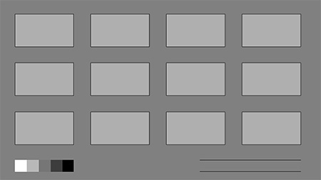
I’ve provided a sample to the right, but I’d strongly encourage you to create your own templates.  The crucial challenge is selecting a category of drawings you make, and identifying the common formatting.  A great example is a thumbnail sheet.  Your first question might be “what aspect ratio?”  It’s totally reasonable to create two thumbnail templates - one for portrait and another for landscape.  Another question might be “how many images do I like to work on at once?”   Additional details get a bit more personal.  My example thumbnail template includes named layers, a value scale for reference, and 50% gray padding between the images.  None of these are requirements, but it’s how I like to work.  

What Will You Template?

In the comments I’d love to hear what you plan to make.  To spark your creativity, here are some things to consider:

1)  A thoughtful filename.  Naming conventions are easier to stick with when you’ve given yourself a framework.  Ex: 2014_XX_XX_Thumbnails_#Topic#.PSD.   

2)  Create an entire project folder as a template.  I often have a project folder (“Spaceship”) with standardized subfolders like “Reference” and “Final”.  Why not create all of that ahead of time and simply duplicate the whole group?

3)  Textured paper. If you’re trying to make pencil-type sketches in photoshop, it’s nearly impossible without a photo texture as your background.  Taking the time to create a convincing ‘sketchbook page’ template is not as silly as it sounds.  

Back to top | RSS | Blog Home

PostedMay 8, 2014
AuthorMatt Kohr
6 CommentsPost a comment

When Feet are Greater Than Hands

This week’s blog post is a field trip.  Yours will be different than mine, but they’ll have one thing in common: we’ll walk for 8 minutes.  Before we start, though, let’s explore the important power you’re about to unleash.

Creative Juices

You’ve undoubtedly heard stories of writers, musicians, and philosophers taking long strolls through the countryside.  Recently scientists have begun exploring this anecdotal link between creative thinking and walking.  According to a recent Stanford study, researchers proved that 8 minutes of walking is enough to jumpstart creative thinking.  Even on a treadmill in an intentionally boring room, walking 8 minutes yields a significant improvement in our ability to think creatively.  I’m sure you’ve experienced this yourself - we’ve all had big ideas while strolling in the park, or walking to the bus.  Ctrl+Paint has offered a variety of creative exercises over the years such as “draw 100”, but today’s is much easier: just walk.  

Go, Now

I said today’s post is a field trip, and I meant it.  Instead of spending the next few minutes reading a glowing screen, I’m assigning a walking homework assignment.  Get up out of your chair, walk out the door, and spend at least 8 minutes walking about.  Seriously.  I don’t care if you’re walking laps around the office hallways or strolling through a public park.  According to the study, it doesn’t really matter.  Regardless of your current situation, I know you’ve got 8 minutes to spare - so go for a walk!


Back to top | RSS | Blog Home

PostedApril 30, 2014
AuthorMatt Kohr
8 CommentsPost a comment
breakthroughs_header.jpg

Unexpected Breakthroughs

Blender 3D - it's free and open source! 

Blender 3D - it's free and open source! 

Recently I’ve been digging into the 3D software “Blender”, and it’s been tons of fun.  Even though it’s seemingly unrelated to digital painting, the experience has recharged my creative batteries. You might not be interested in 3D software, but there’s probably some other rabbit hole you’ve been considering pursuing.  Why not go down it for a bit?

Science and Art

The scientific community has two different types of research: fundamental and applied.  You’re probably familiar with applied research - it makes headlines and turns into patents.  Fundamental research, on the other hand, is often un-sexy and has no obvious commercial use.  Without fundamental research there would be no breakthroughs like wireless internet or gene therapy.  In preparing for your life as an artist, you’ve got the opportunity to balance these two approaches.  On one hand there’s ‘fundamental studies’ which broaden your experience as a creative person.  On the other there’s ‘applied studies’ which hone a specific skill, often pointing toward a specific goal.  How will you balance the two?

Fundamental Studies

In this analogy let’s think of fundamental studies with a broad definition.  For me it might include 3D modeling, video editing, storytelling, and unusual input devices (see image right).  You might have a different list entirely: history, interaction design, sailing, speaking french, or a million other pursuits.  These are the interests that we study out of passion and curiosity, even though they don’t have obvious connections - or obvious commercial application.  They are what round us out as people, and help us understand the world.  They’re what we get psyched up about.  But what if they overlap?

Applied studies

Experience has proven that I’m not particularly good at predicting the future.  I attended art school to learn 3D animation, though wound up painting concept art for video games and teaching on Ctrl+Paint.  In retrospect it’s possible to see a variety of smaller skills that overlapped making these two vocations possible, but none of it was planned at the time.  In fact, much of what I’ve explicitly planned has not happened.  All along the way, though, I’ve valued learning.  If something excited me (like user interface design), I’d pursue it on my own time.  Eventually these skills began to overlap and create unexpected career opportunities.

Balancing Act

A lifelong pursuit of fundamental studies might be extremely fun, but would be hard to fashion into a paycheck.  Laser focus on one goal might lead to achieving a specific career, but it wouldn’t leave you as a very well-rounded individual.  Your challenge is to find the middle ground.  How will you study?

Back to top | RSS | Blog Home

PostedApril 24, 2014
AuthorMatt Kohr
6 CommentsPost a comment

CGHUB and the Fragile Internet

The internet is fragile.  We've grown increasingly willing to trade stability for convenience, and the loss of CGHUB.com this week served as an eye-opener for many digital artists.  If tumblr, facebook, or your favorite image sharing platform disappeared tomorrow would you have a contingency plan?

The internet is so fragile that it decided to erase the first draft of my blog post in a spat of well-timed irony.  Well played, internet.  This blog post’s untimely demise is only one small example, but the larger point is an important one.  We rely heavily on internet services, and it took this week’s unexpected disapperance of CGHUB.com to remind us.  Some lost their contacts, others lost artwork, but nearly everyone lost something.  And from the artists I talked to, no one saw it coming.  Let’s explore some of the collateral damage from CGHUB and consider possible safeguards for the future.

Art Storage

Some of my peers lost their artwork when CGHUB dissapeared.  As in literally didn’t have backed up copies of their paintings.  You may be rolling your eyes at this, but I’m willing to bet you have some documents that only exist in “the cloud.”  I’m a big fan of google docs, and frequently keep my documents saved there.  What would happen if my google drive turned off tomorrow?  It wouldn’t be good.  Even if you don’t leave your original artwork up to chance like my friends did, I’m guessing you’ve got a few documents relying on the cloud for survival.  These services are great, and convenient, but it’s always a good idea to keep additional backups.

Connections

The worst CGHUB assets I lost were my “favorites”.  As a great convenience, the site allowed me to collect a list of my favorite paintings and artists.  This list slowly grew over the years I enjoyed the site, eventually serving as my primary directory of concept art inspiration.  Now it’s lost forever.  How hard would it have been to collect additional information about these artists?  Not very hard.  Personal blog URLs, Tumblr sites, or even Facebook pages would have been easy to collect, and would have saved me a lot of pain this week.  If you’re collecting lists like these on other sites, what would happen if they disappeared tomorrow?  

A Smarter Strategy

I’m not telling you to unplug from the internet and stop trusting google.  Far from it. These services are extremely valuable, and help the community thrive.  Instead, I’m pointing out that we could save a lot of heartache by enacting simple contingency plans.  The best action I can suggest is to hedge your bets.  Instead of focusing all of your internet presence on one site (like CGHUB), become active in a handful.  Keep a personal portfolio website.  Consider what would happen if any of these sites were to unexpectedly vanish, and whether you would be prepared.  And please … please remember to backup your contacts, artwork, or anything else you’re storing in the cloud.  

We’d love  to hear your strategy in the comments!

Back to top | RSS | Blog Home

PostedApril 17, 2014
AuthorMatt Kohr
16 CommentsPost a comment

Make Practice a Game

The other day I heard the ever popular epitaph to "create more than you consume".  It's an especially vague recommendation, but it got me thinking.  Let's turn the phrase upside down - what happens if you consume what you create?

The unproductive kind of "grinding"

My free-time is dangerously threatened by video games.  RPGs in particular serve as a recurring challenge to my forward progress as an artist.   Do you ever find your good, productive, intentions thwarted by video games?  Movies?  I thought so.  With a love of RPGs in mind, I've come up with a game to focus my productive energy: DRPG.  (That's drawing RPG, in case you were wondering).

The DRPG blueprint 

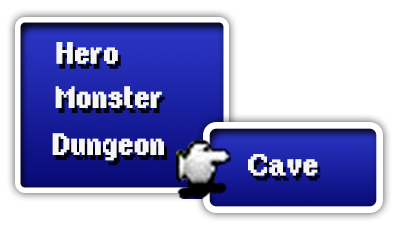
For the uninitiated, Japanese role playing games (JRPGs) are built on a simple formula.  A band of adventurers goes off in search of a magical item which will save the world - usually crystals.  Along the way they fight a horde of increasingly threatening monsters.  By killing these monsters they learn new magic, wear ever more impressive armor, and get cool swords.  What would happen if I made a personal project using these same guidelines?  The bold words from the previous sentences provide plenty to start from.

The rules

 My first drawing might be a character.  Possibly the hero.  But what should I draw next?  Maybe the next painting is an establishing shot - setting the stage for my fantasy adventure.  As a long-time RPG player, I know what happens next.  The hero enters a cave, gets in over his head, and is then rescued by a more experienced hero.    At this point you should see where I'm giong with this:  Cave, monster encounter, and a new hero.  Without any trouble, I've just created three more drawing assignments!  

Whatever works

What I'm proposing is essentially fan-fiction.  The only difference is that I can create my own world and characters -  it doesn't need to start from an existing IP.   Why it's interesting is that I care.  I'm clearly excited about consuming JRPGS - but what if I could have just as much fun by creating my own?  You might like sports games, sci-fi movies, or historical fiction.  Anything works.  The trick to improving at art is practice, and there aren't any shortcuts - so why not make it fun?  Consume what you create.

Back to top | RSS | Blog Home

PostedApril 10, 2014
AuthorMatt Kohr
12 CommentsPost a comment

Matching a Style

Are you a Manga fan?  Maybe American superhero comics are more your thing?  It's likely that you have strong opinions about visual styles.  When it comes to learning art, and preparing for an art career, the notion of style is essential.  Let's talk about it!

Style, not shame

Beginners face a very strange imperative: to be totally unique and original.  To have a vision.  Copying someone else's style can be seen as shameful.  The peak of artistic accomplishment is to blaze a new visual trail.  But in the real world this rarely applies to commercial art.    

Unless you're a fine artist working in the gallery scene, you're probably being paid by a publisher.  You're working on a project that is much larger than and single artist.  Especially if you're working for an established brand, you're required to follow a well-established visual formula.  Marvel hires artists of a certain sort.  Disney has a very specific look. Adult swim cartoons are unmistakable.   What beginners or young artists scathingly call "copying" is a career imperative.  So what does this all mean for you?

Versatility vs. Specificity

As you approach a career in commercial art, you essentially have two choices.  You can choose to establish an extremely specific style (whether it's original or not), or learn to match a variety of styles.  Each of these approaches has pros and cons from a career standpoint.  Creatively, they're very different pursuits.  There's no way I can make this choice for you, and luckily - there's no correct answer.  The crucial thing is to be intentional.  Do your research, and make an informed decision.

Going Specific

One of Sparth's awesome spaceships

One of Sparth's awesome spaceships

Some artists aspire to be the household name for one hyper-specific topic or look.  Especially in the world of editorial illustration, standing out in this way is essential.  In the game industry, some artists are known for specialties - and are hired accordingly.  Bungie employs "Sparth" as their art director, leveraging his proven flair for all things futuristic.  If you've ever seen his work, it's clear that he has a passion for spaceships and epic sci-fi vistas.  Though I'm sure he's perfectly capable of painting portraits, his 'brand' is spaceships.  It takes a lot of dedication to specialize like Sparth has, but the payoff is recognition. 

Staying Versatile

Other artists prefer variety in their career; not painting the same subject-matter project after project.  For this sort of personality, being able to reproduce a variety of styles is essential.  In my game industry experience, I've been required to paint both realistic and stylized artwork.  I've also been asked to design user-interface artwork, which is more "Graphic Design" than it is "Illustration".   To make this possible, I'm constantly redefining my workflow.  Instead of settling on a single way of working, I identify as a lifelong learner.  Staying versatile lowers your chances of being a household name, but it might raise your resilience to a rapidly shifting industry.

Do-overs

This choice can sound paralyzing.  After all, how long does it take to become a Sparth-level spaceship artist?  My advice is to go easy on yourself.  Like all decisions in art, it's not permanent.  You might initially think that working in a specific niche is for you - and then find yourself restless in 5 years.  No problem.  The opposite might also be true - your diverse set of interests might slowly start favor one niche.  Great!  As long as you're aware of the choice, it's hard to choose incorrectly.  

So next time someone accuses you of being unoriginal or of copying a style, don't sweat it.  Copying style is often more than acceptable, it's required. The commercial art world is a big place, and we're all looking for the right spot in it.  Be aware of your community, trends, and your personal preferences.  And of course, have fun with it!  Since this is a very important topic, we'd love to hear your thoughts in the comments.

Back to top | RSS | Blog Home

PostedApril 3, 2014
AuthorMatt Kohr
9 CommentsPost a comment

Your Custom "Button Box"

The only good user interface is one that gets out of the way.  Since Photoshop was not designed for digital painting, there's often a lot of menu clutter devoted to graphic designers and photographers.   In this post we'll explore the 'actions palette', and create a piece of tailor-made user interface for digital painting.

Your own buttons

Especially for those that don't like keyboard shortcuts, the actions palette can be extremely useful.  In order to make your look like the example, you'll need to turn on "button mode".  Now your actions palette is looking great!  No more clutter - just clean, clickable, buttons.   Notice that my example has color coded buttons-  this is a feature in the "action options" and can easily be applied. If you want to edit your actions or create new ones you'll need to leave 'button mode', but it's a nice way of displaying them while you work.

Prune the collection

What buttons should you have?  First off, you'll want to delete Adobe's default actions.  They're not useful for digital painting.  To make this as useful as possible, you'll be creating each of these actions by hand.  Choose wisely, though - too many actions will overflow the palette requiring a scroll-bar.  My palettes usually contain 10-20 actions.   Even though yours will be different than mine, the following examples might help you brainstorm.

Example 1 - "Mirror Horizontal"

"Cut Inverse" - gets rid of the unnecessary parts of your screenshots. 

"Cut Inverse" - gets rid of the unnecessary parts of your screenshots. 

Crucial for creating thumbnail sketches,  costume designs, or anything else with horizontal symmetry.   In case you missed last week's blog post, we talked about creating this action in much greater detail.

Example 2 - "Cut Inverse"

When creating reference boards, I often start with screenshots from the internet.  In these situations, I only want a portion of the screenshot, not the whole thing.  This action allows me to make a selection around what I want to keep, and it erases the rest.  It's very simple, but has become one of my most commonly used actions.

Example 3 - Copy Visible, Paste

This is great when you want to experiment with a dramatic change, but your document has tons of layers.  It selects the whole document (select all), executes "copy merged", creates a new layer, and then pastes the clipboard to the new layer.  You're left with a flat version of your entire painting, sitting on top of the layer stack.

What will you create?

Custom actions are most successful when you develop them yourself.  Downloading another artist's will not solve your specific workflow challenges.  Creating your own time-saving actions won't happen overnight.  Try keeping a notepad document handy, keeping track of repetitive tasks you find yourself doing.  This will help you identify the true problem areas, and give you a roadmap for your custom button box.  Have fun!


Back to top | RSS | Blog Home

PostedMarch 26, 2014
AuthorMatt Kohr
6 CommentsPost a comment

Designing a Versatile "Action"

Photoshop actions are often overlooked by digital painters.  Since I'm a huge fan of this hidden Photoshop feature, we'll explore it a bit in a two-part blog post.  This week we'll go through the process of designing a single action, and next week we'll make a button-box of handy utilities.

Any time you find yourself repeating a series of steps while painting, an "action" might be an appropriate tool to save time.  For this example I'll tackle the problem of painting with vertical symmetry - allowing me to paint one half of an object and mirror it with a single keypress. The technical part is easy, and this video provides an overview - I want to focus on the problem solving.  

The initial selection

My goal is to make this action as versatile as possible.  I can't assume anything about the size or shape of my image, so I'll plan on starting with a manual selection.  Once I have my selection created, the rest of the steps will always remain the same - which is ideal for an action.

Step 1 - Layer via cut

It's easy to overlook stray brush marks around your canvas, so this step simple makes a new layer and places the selected content on it.  It's a temporary layer, and willl get flattened down later.  This guarantees that I'm only reflecting what I want.

Step 2 -Duplicate Layer

This gives me a copy which will serve as my reflected image.  Notice that the position hasn't changed yet.

Step 3 - Transform current layer.  *Center: Side, Width: -100%

This step is less complicated than it sounds.  My goal here is to flip the image and have it line up flush with my center (reflection) line.  The free transform tool makes this easy. While transforming, I simply snap the anchor point from center to center-right.  With this newly defined anchor point, the 'flip horizontally' command flips the layer relative to it's right edge - ending in my desired effect.

Step 4 - Merge layers (x2)

Now that my image looks right, it's time to clean up my temporary layers.  Merging down twice flattens both of these newly created layers into the original working layer, leaving my document as I found it.

The importance of planning

This action might seem a bit more complicated than you expected.  It's actually my second or third draft, improving upon earlier iterations.  The extra steps are put in place to make it as versatile as possible.  It's relatively easy to make an action that will work for your current document, but much more challenging to design it for all possible scenarios.  I strongly encourage you to design actions with this higher level of scrutiny.  After all, once it's properly designed you'll have increased productivity for the long haul -- allowing you to focus on the painting.  What action will you design?  We'd love to hear about it in the comments.

Back to top | RSS | Blog Home

PostedMarch 20, 2014
AuthorMatt Kohr
2 CommentsPost a comment

Learning to Love the Pen Tool

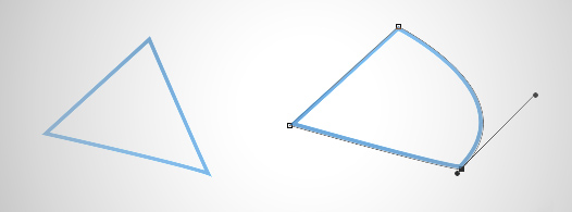
Bezier curves, created by Photoshop's "Pen tool", are commonly dismissed  by beginners.  Over the years, I've relied more and more heavily on these curves (also known as paths).  In this post we'll explore their usefulness for digital painting.

Paths require patience

I was reluctant to incorporate paths into my workflow for years because they're so... boring.  They just didn't feel "artistic" to me, since they're so unlike pencils and paint.  Often they're best used as a preparatory step before adding color or tone to a line drawing.  Tracing all of the major shapes in your image before adding the first brush stroke.. it's a tedious process. In a sense, you're creating a coloring book page for yourself - making staying inside the lines much easier.  Over the years I've come to realize that these paths are very worth it, and tend to save time in the long run.  Exercising the disipline to spend 30 minutes creating paths at the beginning of your rendering might translate into hours of saved fuss later.      

Masking with paths

Though not terribly fun to create, paths are extremely easy to tweak.

Though not terribly fun to create, paths are extremely easy to tweak.

For most cases, paths are the cleanest way to save an important mask in your image. You may remember one of my first Ctrl+Paint videos, found here, where I talk about creating "selection layers".  The hidden layers shown in this video allowed me to save complicated shapes like a character silhouettes.   What I didn' t mention in that video was "paths".  Paths achieve the same end, though do it with a vector shape instead of a pixel one.   The primary advantage here is the ability to modify the shape as your painting progresses.  Paths don't degrade as you stretch and tweak them- allowing for much more versatility and control.

The paths palette

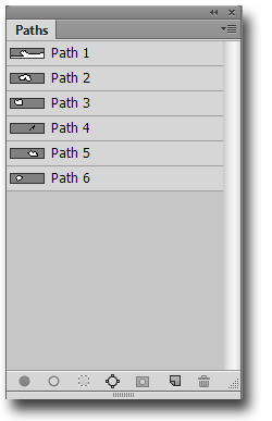
Since you'll want more than a single path in your image, it's important to understand the paths palette.  Like a simplified version of the layers palette, you'll find familiar looking buttons at the bottom.   These buttons allow you to make new paths, duplicate, and even fill paths with solid colors.  Importantly, you can also generate a selection (marching ants) from the active path - just look for the button with dotted lines around a circle. Since the path thumbnails can be challenging to read, it's worth naming your path layers.  Need to move a path from one layer to another?  No problem - just cut and paste, using the paths palette instead of the layers palette.  

 One step at a time

If this is a bit overwhelming to you, my best advice is to start with the pen tool.  It takes some getting used to, so experiment by tracing simple shapes.  Once you get the hang of it, move onto forms that include a combination of curved and straight edges.   Adding paths into your digital painting workflow won't happen overnight - but mastering the pen tool is a crucial skill for digital art and is well worth your effort. 


Back to top | RSS | Blog Home

PostedMarch 13, 2014
AuthorMatt Kohr
13 CommentsPost a comment

Competing for 'Dream Jobs'

Want to work in the entertainment industry?  Join the club.  Jobs in games and film are increasingly popular.  'Wanting a job' is not the same as wanting a specific job.  In this week's post we'll explore the difference.  I'll warn you right now: this is 'tough love', so brace yourself.

Concept art: by the numbers

Studios in the game industry can be found at sites like gamedevmap.com.

Studios in the game industry can be found at sites like gamedevmap.com.

Let's pretend your dream job is creating concept art for video games.  You're now in steep competition with thousands of other artists for a handful of coveted jobs.  As a rule of thumb, concept artists are significantly outnumbered by the 3D artists and animators at their studios.  A single concept artist might supply 3 or 4 of their co-workers with designs.  In a strict numbers game, joining an art team as a concept artist is harder than doing so as a 3D modeler.

Don't believe me?  Try the following experiment.  Pick a studio you'd most like to work for.  Find their website and search for current open art positions.  Is "concept artist" one of them?  I didn't think so.  From my experience, concept art positions are filled extremely quickly.  Some studios are 'always hiring', though your portfolio will really need to stand out.  

Know your competition

Some of your competition can be found at sites like CGHUB.

Some of your competition can be found at sites like CGHUB.

If you're serious about getting a job, it's important to be realistic about the expectations.  This is one of those times where comparing your work to professionals is encouraged.  Remember, art directors and hiring managers compare artists portfolios all day long.   Your work will cross someone's desk and be immediately compared with other artists.  How will yours stack up?  

Even though you don't know who else is applying for the position, you might be able to research current or former employees.  Who used to be a concept artist at the studio?  What does their art look like?  This is essential research if you're serious about a position.

Should you give up?

No.   If you really want this job -- as in, you can't imagine working another job -- then don't give up.  Ever.  Knowing the facts is an important first step, so make sure you're being realistic.  Once you know the competition, your task becomes more clear.  Passion and hard work will overcome the rest of the obstacles.  If you want it, prove it.  

Back to top | RSS | Blog Home

PostedMarch 6, 2014
AuthorMatt Kohr
11 CommentsPost a comment

The Power of "Layer Color"

Painting digitally is powerful and versatile, but that often comes at the cost of clutter.  Compared to working with traditional media, the Photoshop user interface is a bit overwhelming.  In today's blog post, we'll explore one way to keep your interface under control: color coded layers.

layerColor_graphic.jpg

Color coding in the layer palette

 In addition to naming your layers, Photoshop allows you to assign them a color in the layer palette.  If you've ever used a 3-ring binder with color coded tabs, this system will seem quite familiar.  At a glance, I can quickly scan my layer palette and learn some valuable info.  Even though I haven't named any of the layers, each color has significance for my process.  Orange layers, for instance, are always line-art.  Red layers?  They're saved selections (see this video to learn more about how I like to use these.)  Your process is different than mine, so your colors might have different meanings - but the end result is still efficient workflow.

Color vs. name

Many Photoshop pros, such as the fine folks at Photoshop Etiquette, encourage you to name your layers.  This might be a good rule for team-based graphic design work, but digital painters use layers a bit differently.  I commonly make (and then flatten) a new layer every 10 seconds. Naming layers, for me, would be an impractical nightmare.   Color coding them is quick, and conveys a fair amount of information.  Especially since I'll be merging them into the stack, specific names are not essential.  

Grouping by Color

To speed up my process even further, I take advantage of layer groups.  Layers adopt the color of their group - meaning I rarely need to assign my color-coding manually.  Once I've created a group for my line-art layers and set its color to orange, any new layer in that group will automatically be orange.  This rule applies for both new layers and old layers moved into color coded groups.  In practical terms, this means that I set up color coded groups at the start of a painting, and the color coding is essentially automatic after that.  

How will you color code?

There's no rule that says line-art needs to be orange.  Some of my color choices have significance; shadows, for instance, are purple.   My selection layers are almost always hidden, so I like to make them red in order to be eye-catching.  Orange line-art is totally arbitrary - the only important part is that  I remember.  With this in mind, I encourage you to start designing your own color coding layer scheme.   You can start small, potentially one or two colors.  The goal is to simplify your process, not add extra steps - so don't go crazy with this.  Once you've given it a try, we'd love to hear about it in the comments!

Back to top | RSS | Blog Home

PostedFebruary 27, 2014
AuthorMatt Kohr
8 CommentsPost a comment
finishLines_Title.jpg

Learning for the long haul

If you're approaching graduation day, it's easy to think of art education in terms of finish lines.  Whether it's a single painting, an art course, or even completing college - it's easy to envision 'being done'.  The truth is a bit more nuanced, and in this post we'll explore the notion of lifelong learning.  

Graduation

I'm guessing you've taken classes in an subject you never intended to master.  For me it was math: I stopped at 17, and I'll probably never take another course in my lifetime.  Science was a similar story.  As a high-schooler I assumed that art would have a similar trajectory: I'd take the required number of courses and then would be done.  Ideally this would allow me to become a professional artist.  At that time in my life, the world was clearly defined by finish lines: graduate school, spend the summer in vacation, attend the next year of school, etc.  The goals were clear, and forward was the only possible direction.  It stood to reason that my art learning would operate by similar rules.  Then I graduated college, became a game artist, and realized I was completely wrong.

Now that I'm a professional artist, a strange thing has happened: I'm still learning. It turns out the life of an artist, professional or otherwise, is filled with learning.  Of the artists I follow, the most interesting ones are constantly pushing outside their comfort zone.  More importantly, they're perpetually curious.  This curiosity compels them to experiment, study, and improve.  Though I've only spent 9 years in the game industry, it's obvious to me that the most successful veterans are tireless lifelong students.  

Nights and Weekends

Rendering Reflective Surfaces - Taught by Scott Robertson

Rendering Reflective Surfaces - Taught by Scott Robertson

In my free moments, I'm currently taking a self-paced class from Schoolism.com.  It's all about reflective surfaces, and offered by Scott Robertson.  The first week was hard.  Professional or not, I placed myself way outside of my comfort zone in this course.  As a result, I'm gong to learn a lot  by the end of my nine week session.  Though this particular course might not be up your alley, I'd strongly encourage taking online classes after graduating from college.  Especially when you're not concerned with getting a degree, there are tons of exciting courses out there waiting to be taken.

Finish Lines

I've come to realize that art has no finish line.  Unlike math or science, which I'll probably never revisit, there will never be a time when I'm 'done learning' art.  Even though I'm a professional artist and instructor, there's always more to learn - and the process is fun!  If you're currently in school, anxious to graduate -- this is not the end!  College graduation is only one milestone in a process that lasts decades.  If you've graduated from college, it's not too late to start your art education!  Learn to enjoy the process of learning, and stop focusing on the finish lines.

What will you learn next?  We'd love to hear about your self-directed learning in the comments (no matter what stage you're at).

Back to top | RSS | Blog Home

PostedFebruary 20, 2014
AuthorMatt Kohr
16 CommentsPost a comment
cheating_headre.jpg

On "Cheating": Rulers, Grids and Tracing

Last week's post sparked some very interesting conversation - both on Ctrl+Paint and DeviantArt - and I'd like to devote this week to weighing in on the topic.  We'll explore visual measuring, grids, rulers, and tracing; are they methods of 'cheating', or simply tools?  

To begin with, I'll say that the idea of 'cheating' in art is very misleading.  If anyone is cheated by using a grid, it's the artist themselves.  Unless you're plagiarizing, there's no way to 'cheat' while making artwork.  You simply start with a goal (or intent), and then create an artwork using your available tools.  Certain techniques, however, are limiting in the long run and should be used cautiously. 

Using grids on your reference photos

Artists are not copying machines.  Illustration is about making intentional choices - emphasizing certain aspects while de-emphasizing others.  As a professional I can tell you with complete certainty: copying with a grid is not a good way to learn drawing technique.   This method breaks your subject into abstract sectors, eliminating an understanding of form and structure.  If you were required to draw the same object from a different camera angle, you'd be totally out of luck.   It's not to say reference material is unimportant - quite the opposite.  But reference material is most useful when understood - not when mindlessly copied.   

icon.jpg

The one exception to this argument is for complete beginners.  Drawing with a grid is a great way to draw what you see, and to avoid drawing stereotypes or icons.  Like the drawing on the right, beginners often draw a house as they envision it, not like it exists in reality.  Using a grid forces an artist to truly draw what they're looking at.  Once you've internalized this lesson, I'd encourage you to drop the grid from your toolbox.

Visual measuring vs. grids

For additional free videos, custom brushes, worksheets and more more check out www.ctrlpaint.com

Your next question might be "what's the difference between using a grid and using my pencil to do visual measuring?"  Though similar, visual measuring takes place in 3D space, and grids are used on photo reference.  Drawing from direct observation requires an understanding of form and space - requiring the artist to translate what they're observing onto a 2D plane.  Using your pencil to measure angles does not turn the task into mindless copying.  Even with careful sighting and measuring, you're still required to understand the form and structure of your subject.  In short, it's hard.  It takes practice.  Photo reference with a grid does not require the same analysis - you can simply copy one square at a time until your image matches the reference.  Once again, grids are not 'cheating' - they just don't make you a stronger artist in the long run.

Using precise tools: rulers, 3D software, french curves, etc.

ruler.jpg

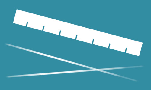
Beginners often worry that using a ruler is a sign of weakness.  It's not.  If your drawing requires precise, straight, lines - a ruler is your best friend.  The big divide between this sort of tool and a grid on your photo reference is understanding.  I might use a ruler to ink my line drawing, but the drawing itself was only possible because of my fundamental drawing skills.  Understanding perspective, lighting, form, and anatomy allows me to put my idea on paper -- the ruler simply allows me to add a bit of polish.   In this example my knowledge and understanding are the real tools, and the ruler enhances my execution.  Grids are not like rulers.

Even though copying a photo with a grid could be described as 'precise', the objective is entirely different.  Instead of empowering your creativity, a grid limits your potential.  It allows you to copy extremely successfully -  but that's the end of its usefulness.  If asked to re-draw the same image from your imagination, you'd quickly realize how little you learned about your subject.

What tools should you use?

Any tool that allows you more control in your art is worth using.  If you're unsure, ask yourself this question: "will it discourage me from learning about my subject?"  If yes, the tool should be used sparingly.  Your goal should be to learn with every image you create, focusing on long-term growth.  Some tools can stunt your growth. Even if a grid can provide immediate precision, it doesn't give you any lasting insights.  

Back to top | RSS | Blog Home

PostedFebruary 13, 2014
AuthorMatt Kohr
10 CommentsPost a comment
Newer / Older
store_footer_concept_d.png